Created 3,250 Days Ago
  • On my 8-inch Android tablet (Samsung Note 8.0), in landscape mode on the Chrome browser, on the main game page, the Twitch thing overlaps the chat thingy.
  • There is no back button fuctionality. Please look into: http://benalman.com/code/projects/jquery-hashchange/examples/hashchange/#test1
  • The high-score list shows every name in square brackets. Not sure if this is intended or a bug.
  • The Skill List should instead be a sort of graphical world-map. Each location can correspond to a skill. I want it to feel like a game rather than an excel sheet!  Also, a good graphical representation can even show the relationships between the different skills.
  • I understand that this is supposed to be an RsBattle 2.0 (a texty-browser game) but it'd be a whole lot better if it was more graphical. Graphics are much easier to do now thanks to HTML5 and jQuery.   I wanna see a hammer come down and hit the metal bars, even if it's very simple graphics. I wanna see a little explosion of stars or fireworks when I level up. I want the progress bars to be animated and feel "alive"! I need some visuals!
  • Please make the game mobile friendly. I dont even own a PC at this point in my life. My Android tablet does 99% of the things I used to do on my PC. I'm even typing this using a bluetooth keyboard on my Android tablet.
  • A big red "Error! You must have a [Small Net] equipped to catch the Crayfish." is too scary. It looks like something broke. Instead, it should be more subtle... and not screaming in red color like that.
  • The inventory is really unintuitive right now. I have to click each of those little categories to try to find something. Can't you just dump it all in one or two categories and sort a scrollable table by item type? It doesn't add much to the gameplay btw, requiring somebody to equip a small net to catch a fish. It should do it automatically! :-D Or if you really want that in there, then maybe a, "Fishing crayfish requires a small net. You have one in your inventory. [Equip it]."
  • On the Action List for skills, change the background color of the actions that you can't do yet... like a very very very light pink color to indicate a "cant do".
  • The info like, "To smelt the Bronze Bar, you need to click on the blue button that says Smelt Bronze Bar below. Clicking on a red button will result in your character losing more Energy than normal. Once your character is out of Energy, you can restore it by clicking on the   Restore Energy button." ... is MAYBE useful but only the first time. It should permanently automatically hide itself after I've done a few actions.
  • When training skills, the percentage is written in the gray area (after around 60%) of the progress bar. The gray part is the part not done yet, so it sometimes feels the percentage is what REMAINS rather than the progress. Perhaps the percentage can be moved to the green part?
  • The anti-botting features seem pretty weak atm. Anybody can simply make a bot that reads the (CSS) color applied to the button and click the correct one. Or hell, even directly communicate with your AJAX to send commands. What can you do? Require a bit of brain processing instead of the mindless clicking grind.
  • The "Who's Online" shows one huge row per character. How about make them show up similar to how a typical forum's "Who's Online" shows up... with tiny avatars and info on what they're doing exactly: "Fishing sharks".
That's all for now. I'll have way more soon!
Posted 3,250 Days Ago
  • It's annoying having to log in like every time I come back to the game throughout the day. It should keep me logged in: FOREVER.
Posted 3,250 Days Ago
* I'd say to just close it on mobile pretty much. iOS can't really view it without getting flash anyways.
* Will look into it.
* Brackets are when a character profile is displayed, not just their name. Mobile doesn't handle the tooltips very good, so they probably don't show for you. When you mouse-over it though, it'll show their character image and stuff.
* I'll be changing the way that skills are displayed in a little bit.
Don't really support mobile. Lol. :P
* I'll change it to yellow or something.
* The only problem with loading outside of the way it is now, is that it will just be more load on the server. It can be done, but that's how it was last time I made this game and it lagged down the server every time someone would open their inventory (considering they could have limitless amounts of items).
* I'll look into changing the text while starting training.
* It changes depending on how much XP you have, since there is only a certain amount of room in each area I can write. I may more it outside of the bar completely, it would be the only solution.
* Yup, that's correct. There literally isn't really anything I can do to prevent it, which is why the Energy system is in place. I might release a special for subscribers in the future pertaining to this, but I'm still debating on it.
* It's only like that for mobile. You can see what they're doing and more information by clicking on the drop-down above their character image.
* I don't really know what I'd do to prevent that. It's just your login session timing out.
Posted 3,249 Days Ago
Reply:


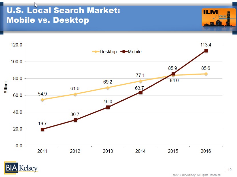
.. and the numbers are probably even more severe for GAMERS specifically!


Pfft... also you can't be scared to do stuff because it'll cause server load. You have to be a smart coder and figure it out somehow!!! *cracks whip* There's always a way to make a new feature not kill the server. :-D Don't be a noob! :-D

Login session timing out? It shouldn't! Are you using PHP session or cookies?


Posted 3,249 Days Ago
PHP sessions
Posted 3,247 Days Ago
Well if the problem is widespread, you can use cookies.